I distinctly recall the phrase ‘walls that teach’ coming into my orbit as a young teacher and the way it made me stop to question just how I was using the visual environment in my classroom. Like many teachers ‘back in the day,’ my walls were more about decoration than learning – birthday charts, alphabets, posters, work samples … and it wasn’t just my walls, my classroom was awash with what I now think of as ‘dingle dangles’ and there were WAY too many dingle dangles! This mostly consisted of student work (even worksheets!) pegged on string across the room, far too high for the children to read but low enough for many adults to have to fight their way through as they entered the classroom. Again – more decoration than anything else. Early on in my career, I never really stopped to think about why I was posting the things I chose to ‘display. ’Maybe it’s because I spend so much time in classrooms or perhaps it’s the plethora of images shared on social media … whatever the reason, I certainly think about it a lot more now!
I have previously shared several posts on learning environments. In 2014, I wrote about the first impressions that learning environments make. In 2015, I wrote about the amazing environment at Mother Teresa Primary School and in 2019, I wrote about curating staff and planning rooms - how visual spaces in schools are as important to adults as they are to children.
In this post, I want to focus on the simple aspect of the way we use our walls. Having readily available ways to share visual images through social media has no doubt contributed to a renewed attention to this aspect of our work. What is heartening to see is a move away from ‘Pinterest’ inspired walls (the more contemporary version of my walls in the 80s) to more authentic, co constructed and purposeful walls with a focus on learning rather than decoration and display. This shift has been happening for many years of course but social media allows it to be more present in our thinking and to be discussed more widely. Despite the fact that digital and virtual learning spaces are now part of the landscape, most early and elementary classrooms have areas are designed to house ‘hard copy’ documents of some sort. What is on the walls is easily and immediately accessible. It is tangible, shared and very public which provides a very different experience than a screen.
When entering a classroom, I am acutely aware of the messages the ‘walls’ (and the use of space, furniture arrangements, choice of materials) convey about what is valued. We know children learn a great deal simply from what we do and this includes what we choose (and don’t choose) to document and share and HOW we go about the documentation and sharing. These decisions teach surreptitiously. If 25 identical art works are proudly displayed we promote conformity. If the walls only ever display ‘final products’ we promote product over process. If it is only the educator’s words or annotations on the walls we promote our voice, authority and ownership. If the walls are filled with commercial posters and decorations, we promote decoration over functionality. As we face a new school semester or year, we have an opportunity to look at this aspect of our learning spaces anew. Some questions for reflection might include:
What (and who) might these walls teach?
What story are we telling about learning?
What do our walls say about what we value?
What is dominant in the space? What takes up the most space? How important is this and how do children benefit from this?
How might we use documentation to support children’s understanding of their learning processes?
How might we invite children to compose and design the documentation?
How do children use what is on the walls? What does it mean to them?
Can our children talk about the significance or purpose of what’s on the walls? What sense of ownership do they have?
How do WE use these walls? Do they grow with the inquiry?
Given inquiry is deeply rooted in process and an emergent design - how can we allow this documentation to build over time?
How can we use our public documentation to prompt review and reflection?
How can we use our walls to hold traces of learning that allow us to revisit and go deeper?
How much is too much? Are we overloading the space?
How might we house previous stories of learning?
What might we worthy of year-long ‘display’?
Perhaps the most important question to ask ourselves is: What’s the purpose? Ultimately, what is on the walls should be in the service of children’s learning. In an inquiry classroom, we can think of the purpose of wall documentation in three broad categories that support children: information, explanation and celebration.
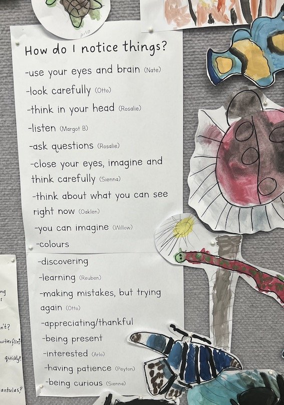
A summary of ways to ‘notice’ by 5 year olds at Launceston West primary School. Useful, co constructed information to return to.
Information: here is where children and educators use the wall as a resource, reference or reminder. Ideally, much of this is co-constructed with the aim being to strengthen agency and independence by having items in the space that children can go to for help/reminders/examples. These might include anchor charts (co constructed), criteria and exemplars, question or dalogic prompts, QR codes that link to often used sites, reminders and instructions (for example, menus of thinking routines or graphic organisers that children might choose to use), timetables, protocols and learning agreements. I have been in several classrooms where there are anchor charts EVERYWHERE, yet the children can tell me very little about what they are, let alone whether they use them. We need to be mindful of information overload. Less is more.
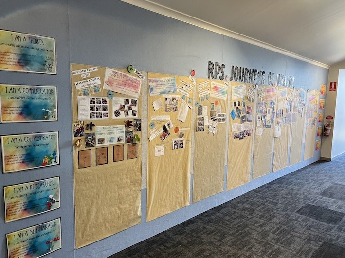
Narratives of Inquiry at Riverside Primary School - part of the shared documentation in the school’s central hallway . These explanations are gradually built over time.
Explanation: Central to the work of an inquiry educator is the emphasis on metacognition. The way we document with and for learners can be a powerful contribution to helping children understand not just what they are learning but how. I like to think of this as ‘telling the story’ of an inquiry as it unfolds – whether it is a whole or small group project. This might include photos of children engaged in their learning, learning samples, evidence of changed thinking, questions driving the investigations, etc. The key to this is the annotation – the documentation acts as a form of explanation to ourselves, to families and the wider community. What are we doing? Why are we doing it? What are we learning? What are we wondering now ? This kind of narrative documentation helps build the meta-language of inquiry and explains the cyclical, iterative nature of the process. When the annotation is constructed or co constructed by children – the ownership and engagement is even stronger. This kind of documentation is powerful during an inquiry and can be captured and revisited long after the inquiry has run its course. The wall documentation can be taken down and housed in a journal or photographed for a digital record. Key pieces or traces of the story may remain so that links can be made as new inquiries emerge. This kind of wall documentation can also serve as a prompt for professional dialogue. Many years ago, I watched educators at Island Bay teachers in NZ holding a staff meeting in a classroom as they regularly did. The host teachers would stand at their wall and tell the story of learning - inviting questions and feedback. Such a powerful and effective vehicle for staff learning.
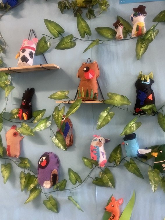
A celebration of carefully designed and created art works proudly displayed at Hartwell Primary School
Celebration: there is no doubt that public sharing of children’s artefacts is one way of honouring the hard work, imagination and creativity of our learners and can be the source of pride and motivation. Consider having a smaller area of the classroom or corridor intentionally devoted to the celebration of what Ron Berger describes as ‘beautiful work’. By this, he does mean necessarily mean aesthetically pleasing - but more work that is often the result of multiple drafts, responses to feedback and gradual crafting towards excellence. This work is produced for a real audience or in response to a real challenge or problem. Having some examples of the various drafts/attempts etc leading to the final product can make the celebration even more powerful. And what is celebrated in this space should not selected by the educator alone. We want children to recognise the opportunity to lift each other up and be part of the decisions about what belongs in the ‘gallery’.
As with all aspects of our work, what we put on the walls should be highly intentional. Involve your learners, avoid being seduced or intimidated by what you see online, remember less is more and keep asking: ‘What’s the purpose?’
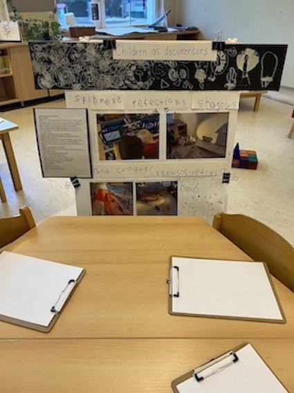
Nellie Gibson at the International School of Prague works with her 5 year olds to enable them as documenters of their own learning.
How do you use your walls to nourish inquiry?


